Go to LA Forum Website
The first part of our process consisted in studying the online content in correlation with the overall vision of the non-profit. We first outlined the strengths of the organization that were not put forward by its online representation and proposed a list of goals for the redesign. In parallel, we tracked redundancies and inconsistencies in the way the content was organized. In constant dialogue with the LAF’s staff, we gave a level of hierarchy to each type of information indexed.
During the second part of our process, we developed several schematic schemes highlighting how different organizational structures would position a same content. We ran several scenarios with different priorities, such as reporting, archiving, entertaining, debating, and showcasing. Several hybrid scenarios were developed. With a specific scenario in mind, we finalized a new website map that took into consideration how important the content was hierarchically, but also how purposeful it was to the outlined goals and how effectively it was accessible.
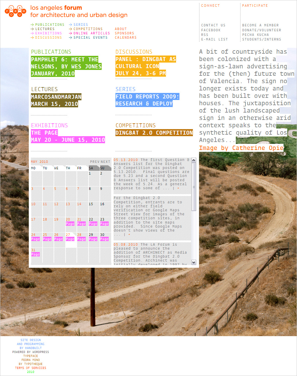
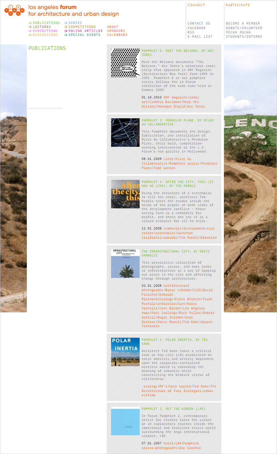
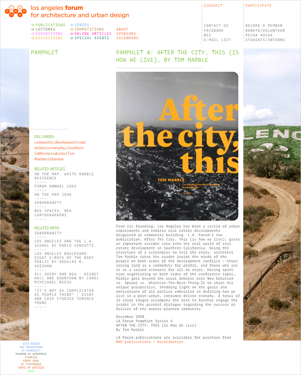
An important aspect of this project is that the LAF, a non-profit organization, has only a very restrained amount of hours devoted to the maintenance and updating of the website. Each solution we proposed considered the long-term evolution of the site, embracing the fact that it had to almost generate itself. Solutions costing less input time were preferred to more custom ones. Each category was color coded in a CSS format, giving the site more visual interest without needing the design of custom headings. The type became an important part of the site’s visual identity. We opted for a monospaced font, keeping consistent the amount of glyphs visible on a title line, facilitating the work of the site editor. Wanting a distinct look for this design-conscious organization, we were not satisfied with the default “safe” typefaces. Instead, we chose to use the new @font-face rule in CSS and a font-embedding system based on W3C standards, providing a secure, reliable way to use fonts whose files are hosted on a global network of servers (cloud hosting). Fedra Mono, our choice form the Typotheque foundry in the Netherlands, lends an edgier look to the clear-cut site.
Since collecting, formatting and editing images is what takes most time in the updating of the site, we assigned images locations only where necessary, keeping their quality really high. With a site now mainly typographic, we looked for opportunities for exceptions. The main one is the big scale placement of an image in the background of the text. It is a space for invited curators to showcase photographic essays or illustrations to web only content.


