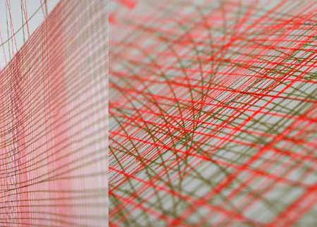
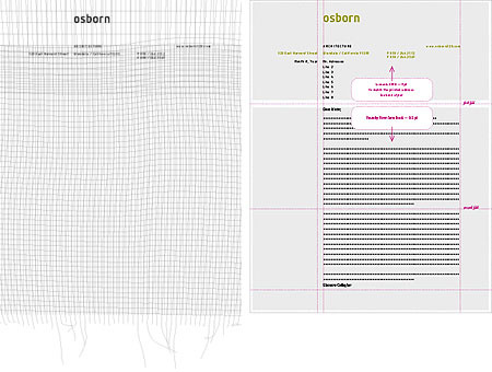
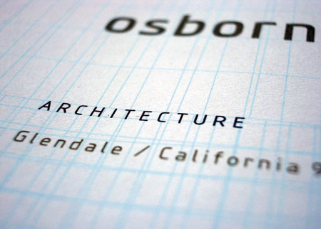
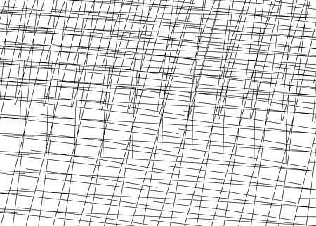
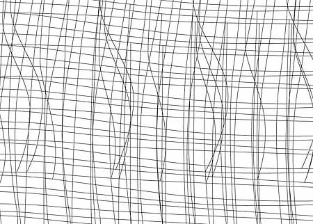
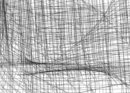
Osborn’s corporate identity is based on a simple system of several superimposed regular grids that create infinite pattern possibilities and a sense of space. The fabrics created eventually become typographic grids or patterns, from the most ordered to the most asynchronous. We are exploring regularity and tension, unpredictability and precision.
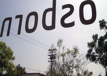
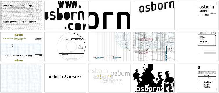
We opted for a purely typographic logo flexible enough to be used in the different departments and their different contexts, on the various types of documents produced.
It is a mix of rectangular and supple shapes, very legible at small scale and revealing its typographic details when used on architecture-scale graphics.
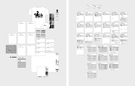
Corporate forms are a major element of Osborn identity system and are used everyday in the office. We set a strict system across more than 30 forms. The identity remains consistent while informational structure of legal or administrative data varies.
We have a very diverse set of documents ranging from construction observation to timesheets to the basic fax transmittal. The primary graphic decisions were about the legibility of the title, fonts, and lines across the various methods of transmission. All layouts were translated into pdf programmed forms and put on our intranet with a digital instruction manual. They are optimized for printing, faxing, archiving and use on paper or screen.
